UX Case Study
20 years of software bloat were causing tremendous usability issues in a legacy b2b product, dramatically increasing the company’s support costs. Through deep user research and a careful balance of the flexibility that users required, database style interfaces were transformed to intuitive, automated, and delightful processes.
Background
Admire is a b2b Saas product that helps nonprofits to manage their fundraising. I was hired to spearhead the product redesign, reimagining the everyday experiences and processes our users faced and creating a new future for our company.
My Role
I handled the end-to-end product design process, from research and project scoping to ideation, developer handoff, and launch.
Going Broad with Generative Research
I started with a generative research study that would inform the scope and priorities of the rebuild. The research goals were broad, as I was learning about users’ environments, mental models, and pain points for the first time. To gain a full understanding of the client base, I interviewed users from many different client types, resulting in 20 user interviews, both on-site in clients’ offices and remote.
Synthesizing Research, Uncovering Mental Models
20 user interviews left me with more data than I could analyze on my own, so I included the full product team to help me synthesize and understand the learnings.
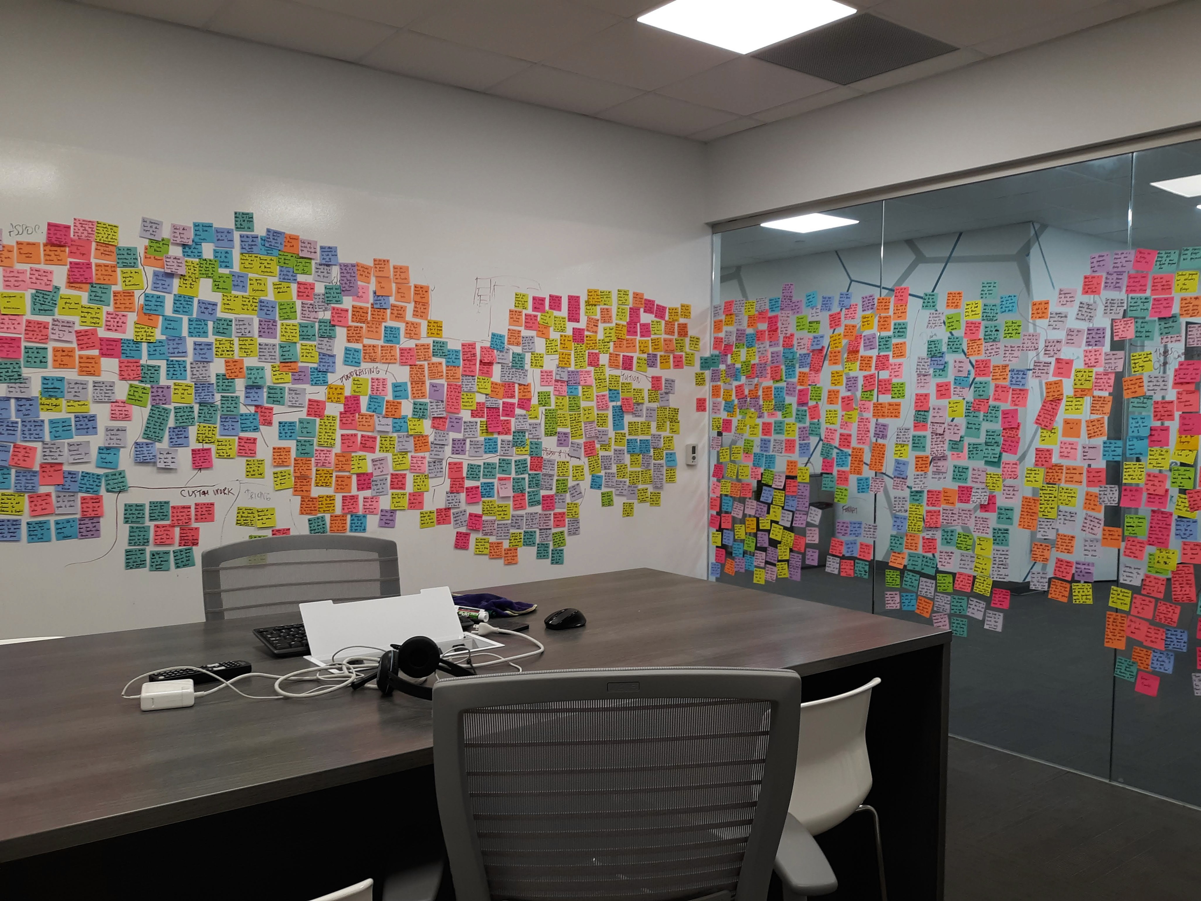
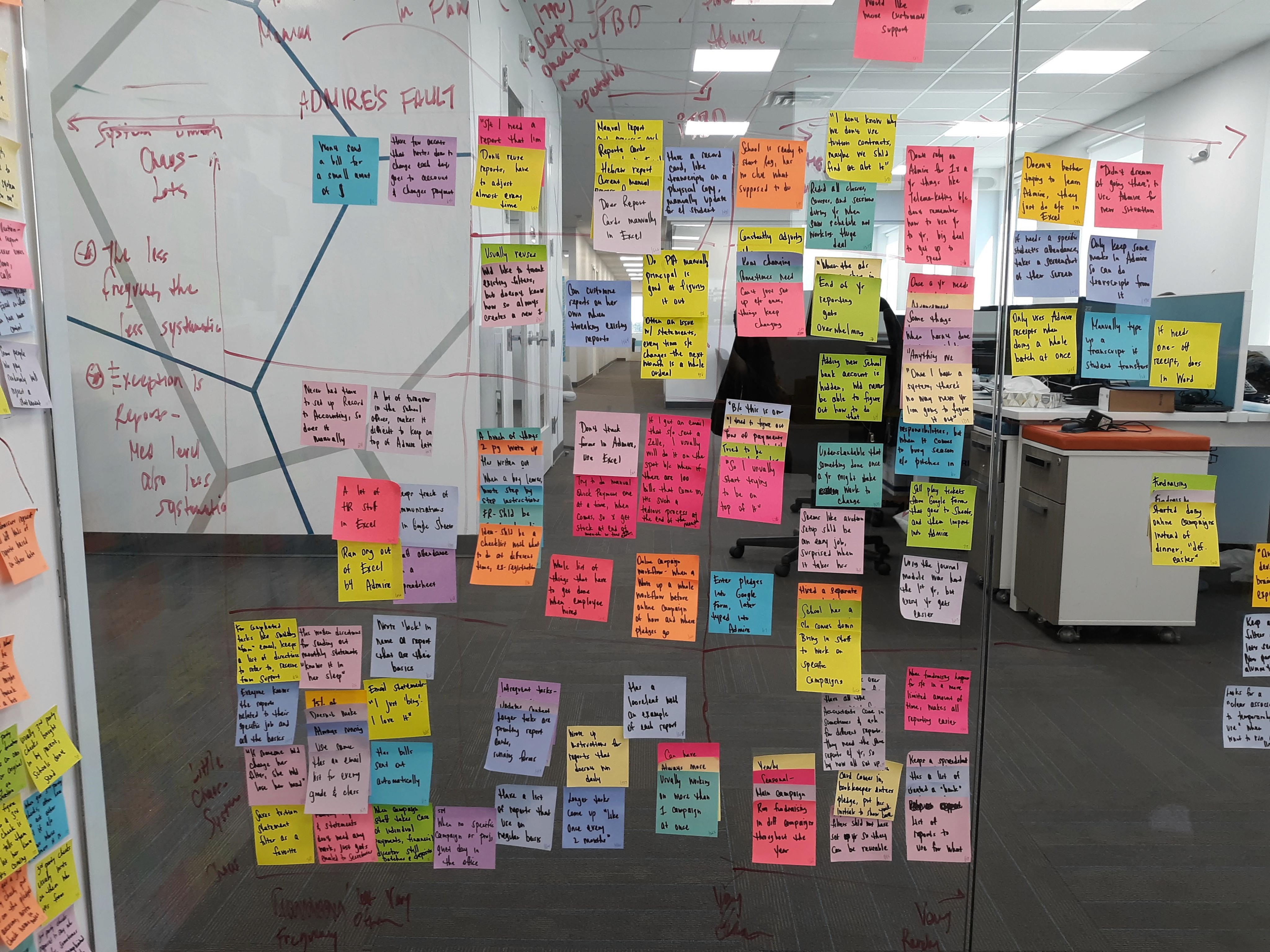

Together with development partners, I conducted a massive affinity mapping across an entire conference room, gathering high level themes and patterns.

The visual high-level insights gave stakeholders a vision of where the rebuild can go, and how it can solve deep user problems.
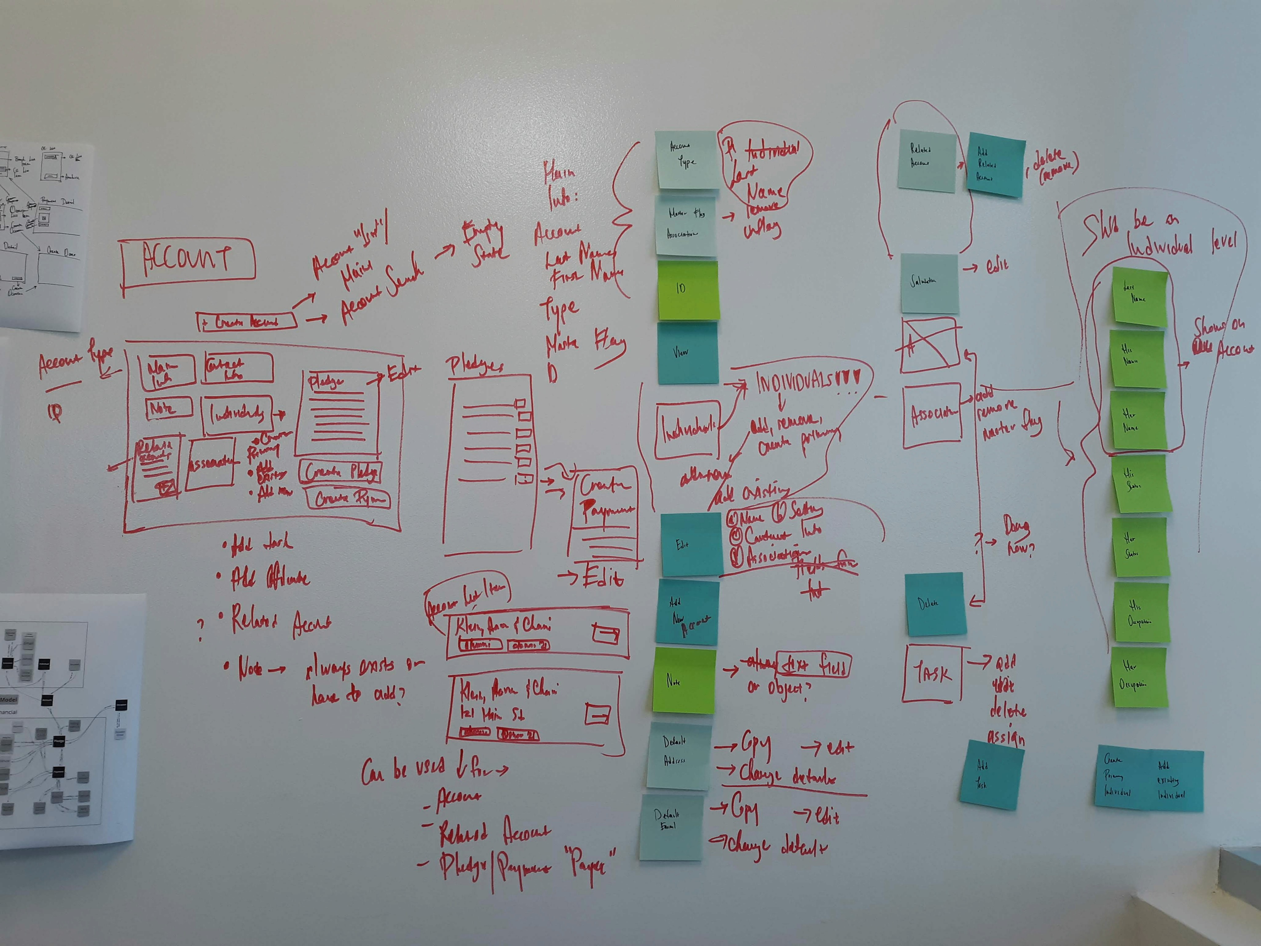
OOUX for Strategic Scoping
Using an abbreviated form of the OOUX (Object Oriented User Experience) process, I mapped out the entire system and how elements related to each other. This allowed me to scope the MVP in a way that would lend itself to efficient development practices.

Consistent Research Diving Deep
The initial generative research highlighted problems to solve on a broad level, but as I reached various aspects of the interface, I needed deeper insight into users’ mental models and processes in specific areas. Here, I tapped on research methods including user interviews, user surveys, concept testing, guerrilla research at vendor conferences, and usability testing to ensure clients’ needs were understood at all stages of the process and were reflected in the details.
In all, I conducted more than 60 formal interviews with users. This consistent research helped build a culture of research, driving an understanding of the value of research in mitigating risk and uncovering opportunities.
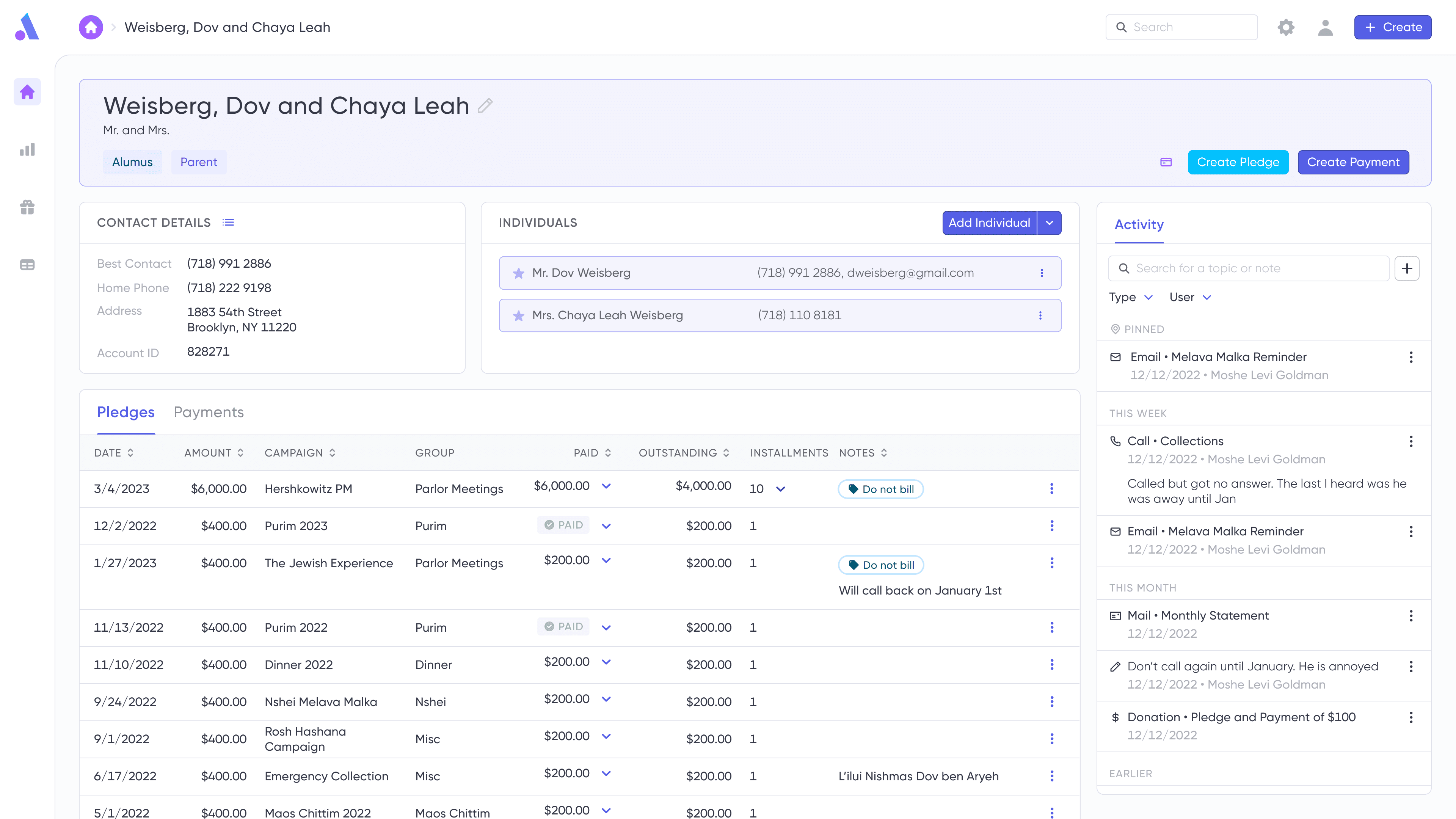
Problem
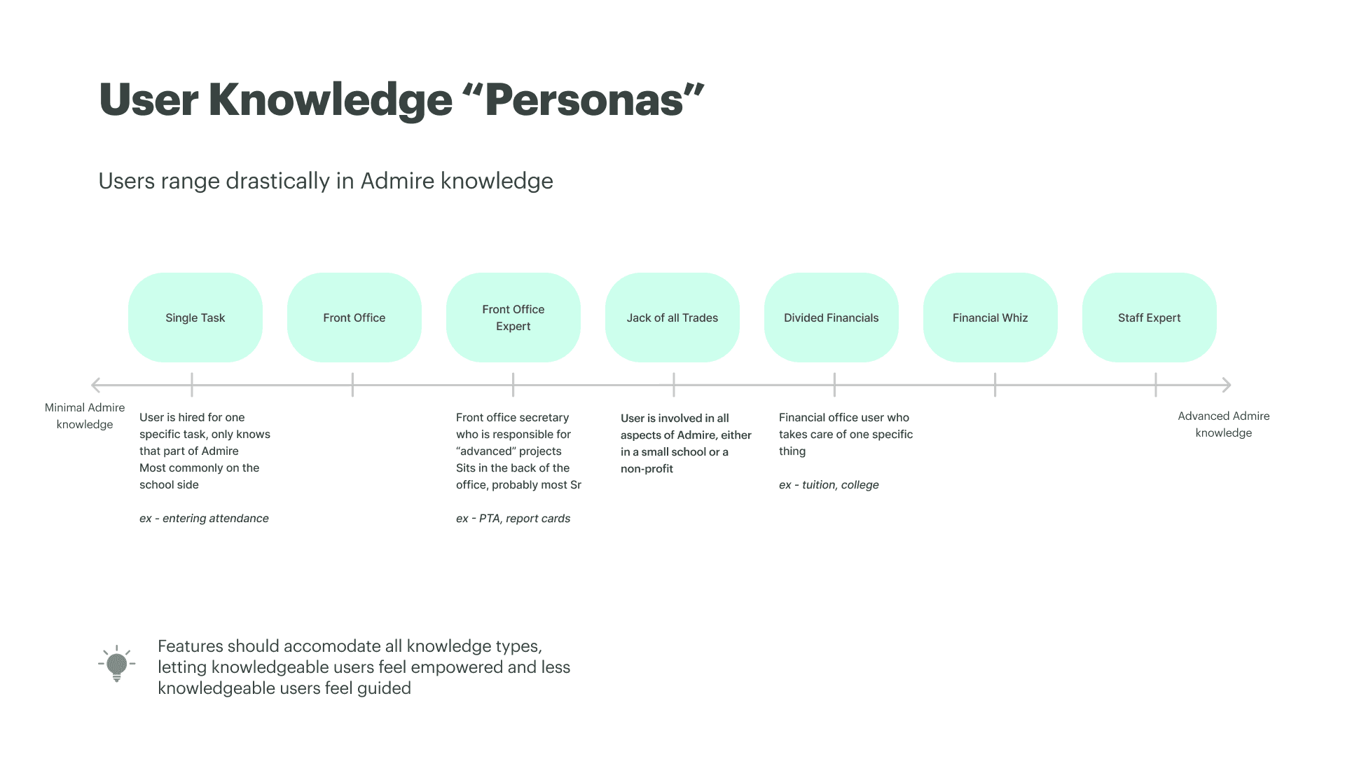
Data retrieval was a critical feature of the software, and the varied ways clients managed their data led features to lean on complex coding concepts to keep things versatile. Advanced users were thrilled, but basic users were too overwhelmed and intimidated to dive in on their own - leading them to rely on the backlogged support team for the smallest needs.
How might we increase usability for basic users without compromising on the flexibility advanced users had come to expect?
Research showed clear pattern of frustration: basic users felt like the filters, which were modeled on programming concepts, were a foreign language.
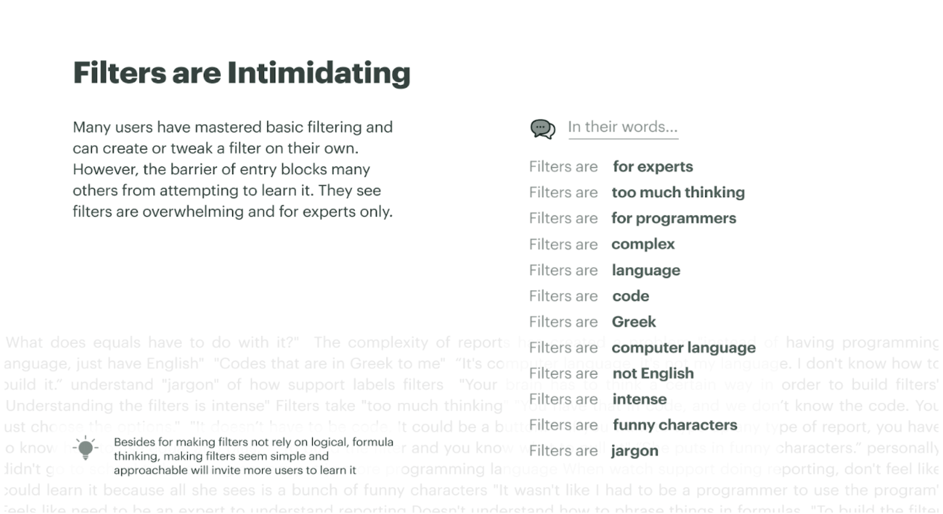
A slide used to present generative research findings related to filtering pain points.
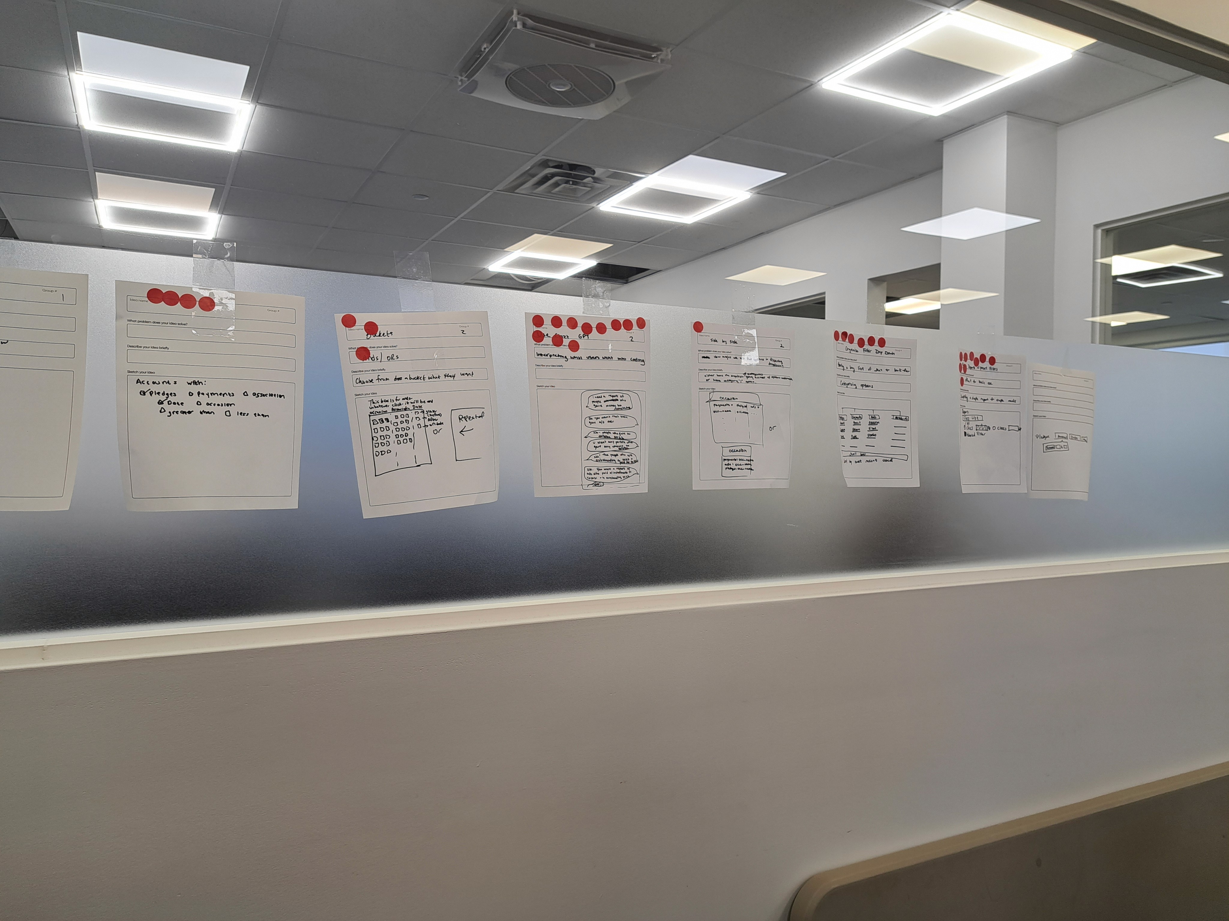
Workshop & Ideation
To begin ideating on solutions, I planned and led an ideation workshop for the company’s development and support staff, who I knew had great ideas waiting to be shared.

Solution
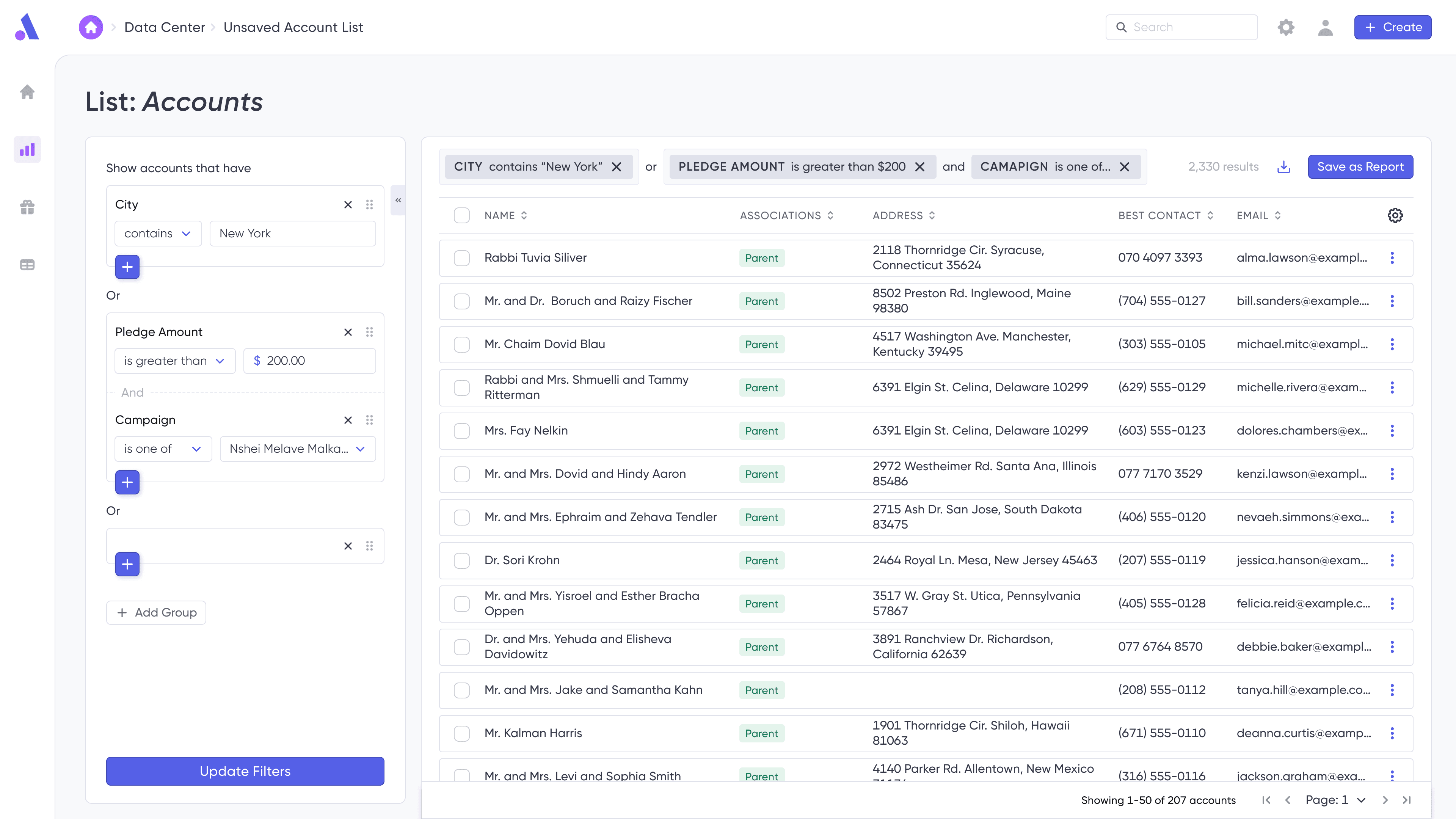
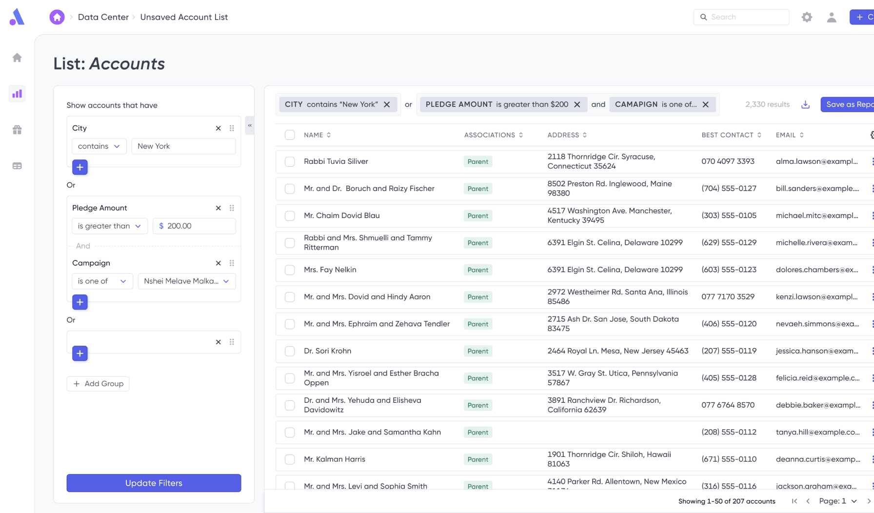
Users knew what outcome they wanted, but didn’t know how to find the filter that would get them there. The mental models were clashing.
A two-step search gave users mental and physical space to search and browse through the available filters.
How might we support filter conditions that work together and others that work independently?
I used visuals and spacing to represent data concepts. Usability testing showed that the dotted lines and semi-adjoined cards helped users intuitively understand complex relationships that they couldn’t even explain.
Testing
Two rounds of usability testing and refinement helped bring the filtering screens toward perfection. During the first round, users helped choose a direction to go in, and gave feedback on the overall concept. During the second round, users struggled with smoothly moving through the process, which was solved with better visual hierarchy to guide the user to the next step.
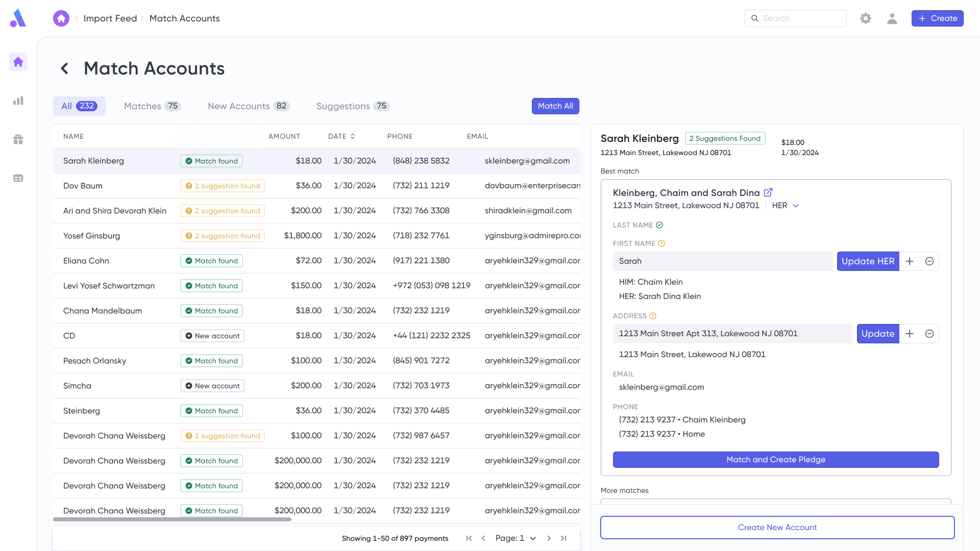
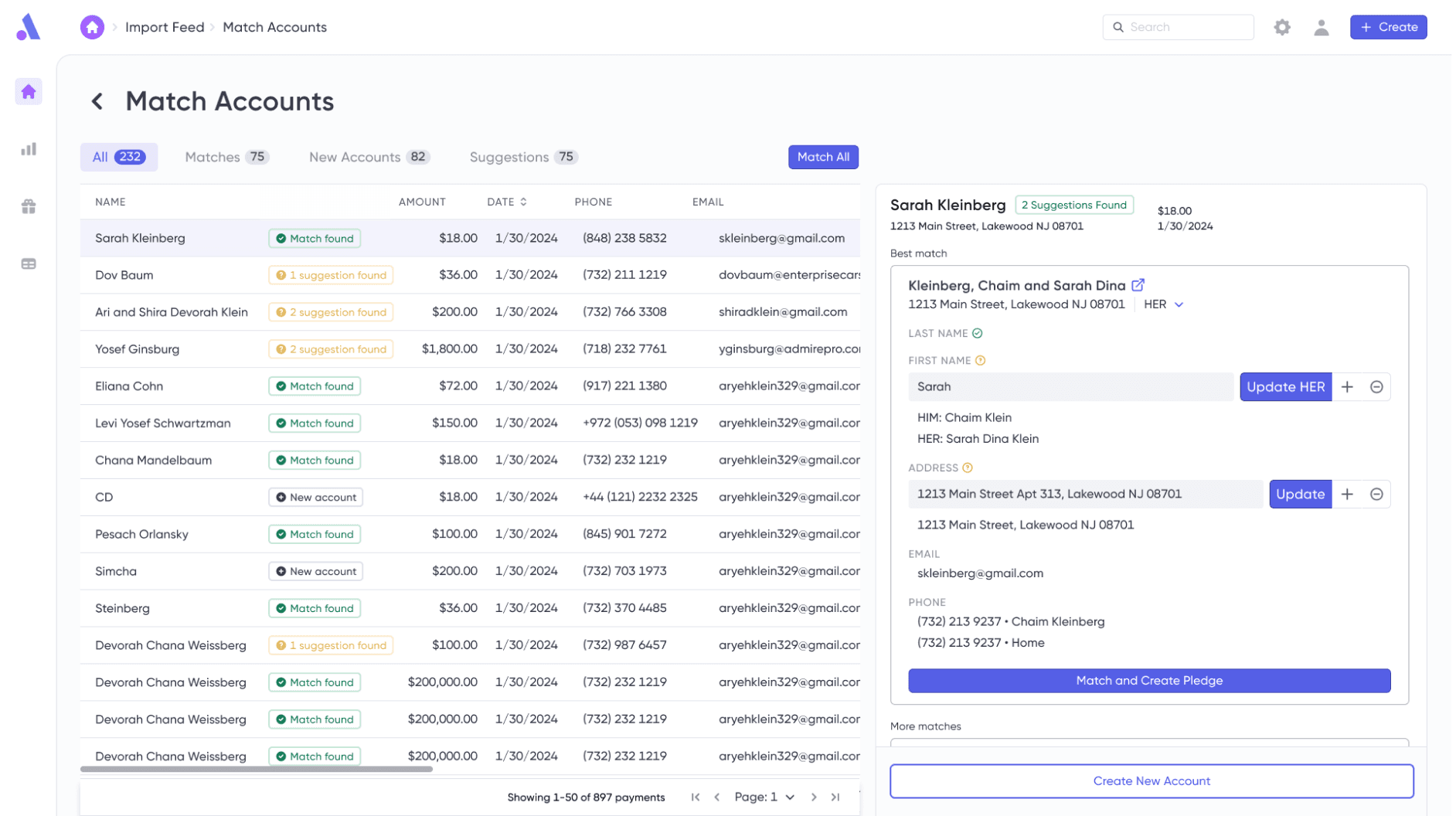
Problem
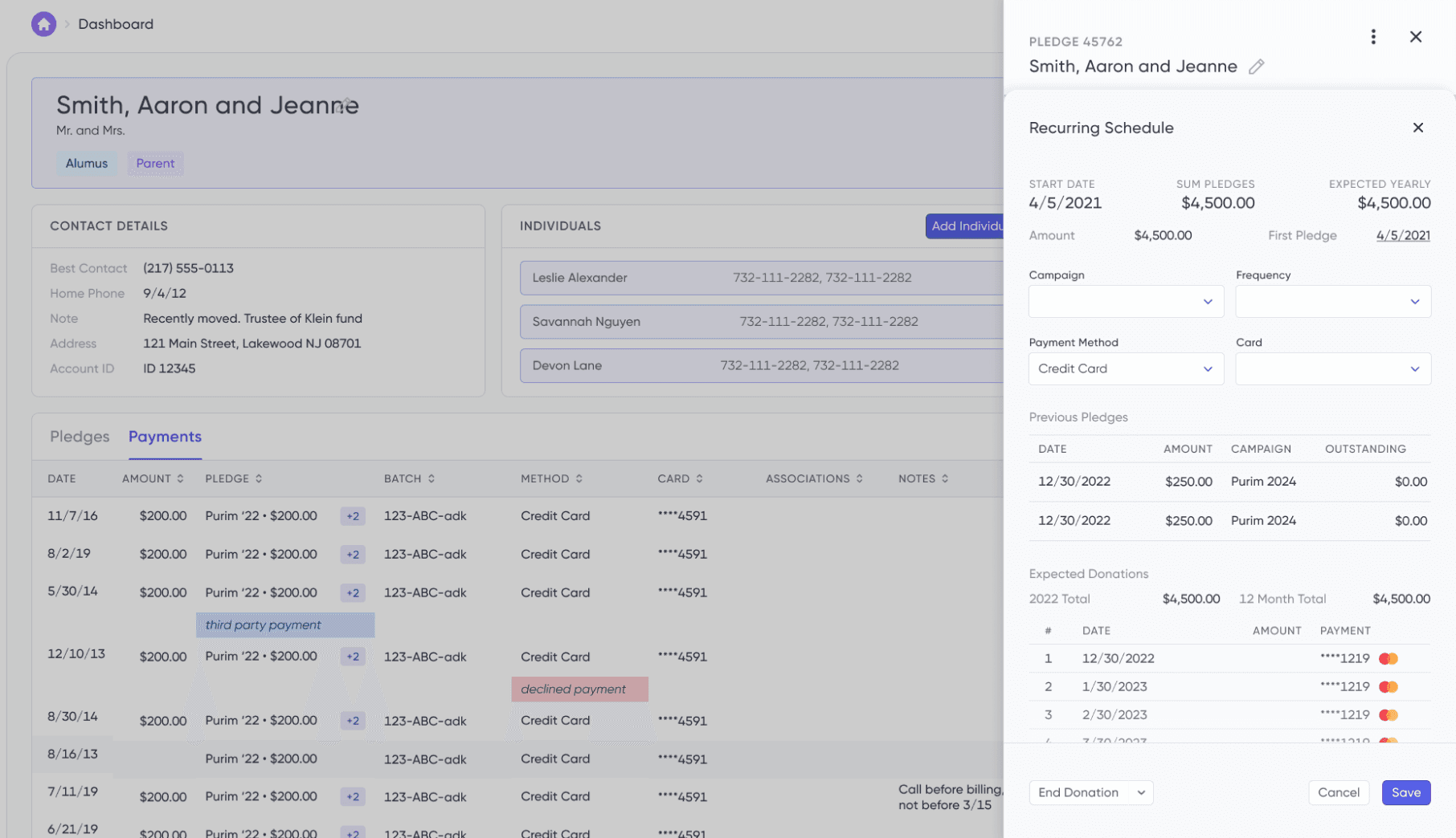
Matching imported donations to existing donor accounts was a mind-numbing process.
Many users preferred manual oversight to keep their data clean, but also wished they could get the data in quickly so that they could have updated reports during a campaign.
Many users did not take advantage of the legacy system’s “auto-match” feature, because they did not trust what was going on behind the scenes.
How might we enable users to match info accurately while removing the tediousness of it?
Solution
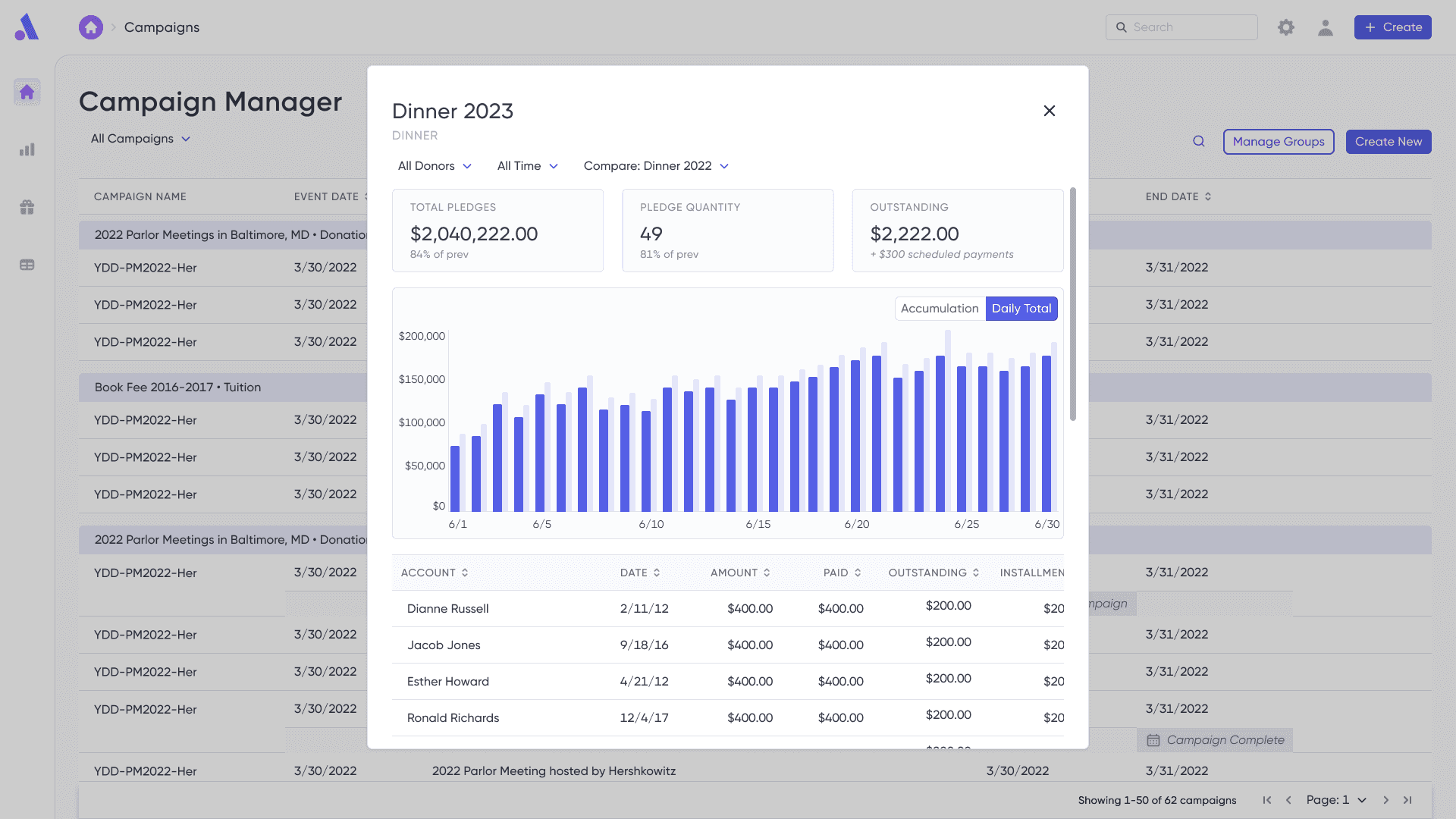
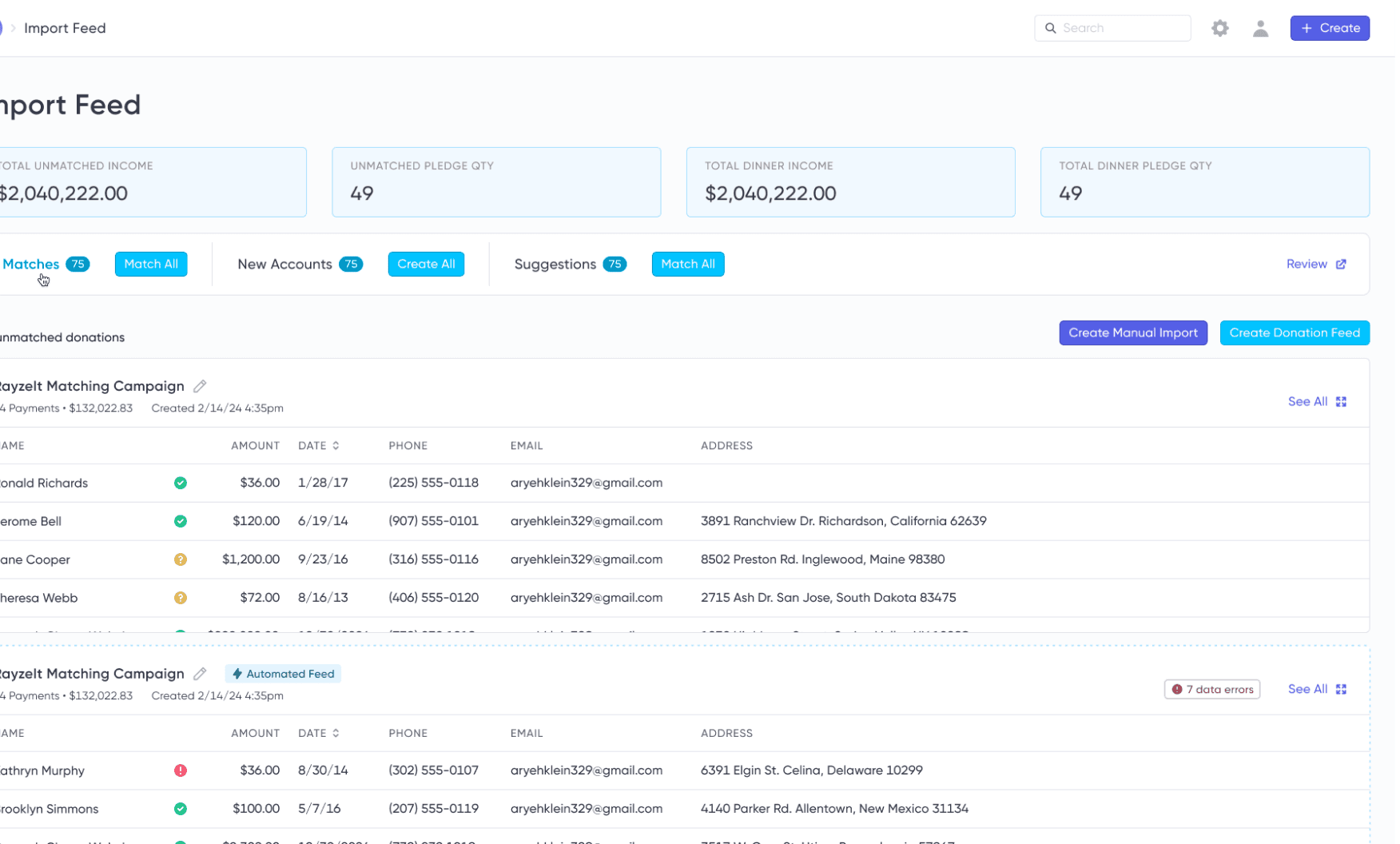
Firstly, I separated importing from matching to allow clients to get value from their data through stats and dashboards as early as possible, without being forced to match first.
To give users more control of their matching, auto-match features were greatly expanded and explained, allowing users to granularly choose how much they want automated based on how confident the system is with the match.
Testing
Usability testing showed that due to the complexity of the imports screen, users struggled to find the initial starting point to create a new import, as it was nestled between stats. I adjusted the visual hierarchy and layout to surface this information right where they expected it, near previous feeds. This subsequently led users to find the “New Feed” button quickly and begin importing.
Quick stats gave users value from their imports as soon as they hit the system, no need to match first
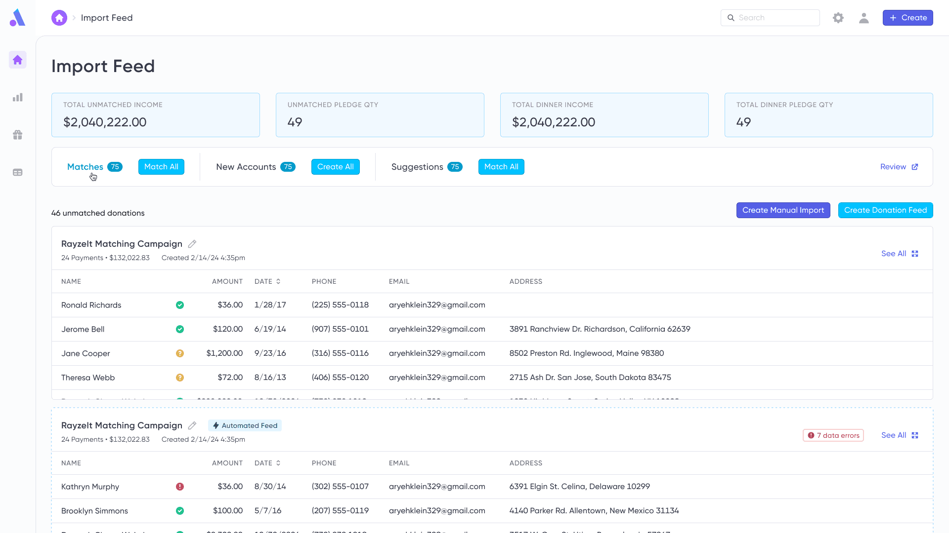
After users struggled to find “New Import/Flow” during testing, I adjusted the visual hierarchy to surface this information right where they expected it
Morale was low. The support, sales, and account teams were supporting old and outdated products and dealing with customer complaints that were beyond their control. I worked to engage cross-functional colleagues into the rebuild process, allowing the positive vision for the future to spread outward.
Team Workshops
Multiple team workshops, including design studio, marketing, and research synthesis workshops, invited cross-functional partners into the design process. The diverse and converge format encouraged ideation while hearing from all members.
Engaging Teammates in Research
I leaned heavily on other departments who engaged with clients to help with research recruiting, guerrilla research, and more. This served to give me more perspectives on users, surface clients who would be happy to engage in research, and built momentum for the upcoming product.


Go-to-Market Leadership
I played a pivotal role in shaping a go-to-market strategy, working closely with sales, customer success, and marketing teams. I collaborated with the sales team to establish a robust and tight sales funnel, and worked with marketing vendors to craft compelling messaging that reflected users' pain points. I also partnered with the customer success team to streamline onboarding, focusing on reducing time-to-value for new clients.
Transformative Results
The redesigned Admire launched through a private beta program and exceeded all expectations.
The sales pipeline has been transformed. New prospects consistently express excitement about the user-friendliness and approachability they observed during demos, leading to a dramatic decrease in time-to-sale. Early users have become passionate advocates of the product, driving organic growth. Monthly sales goals are consistently met and exceeded, with user-friendliness cited as a key decision factor by prospects.
After onboarding, support requests dropped dramatically as users operated independently. Support tickets per user dropped from approximately 2/week to approximately .5/month, validating our design decisions around simplified mental models.
Long-term Impact
The success demonstrates how user-centered design, combined with strategic go-to-market execution, can transform the entire business trajectory. By solving fundamental usability challenges and ensuring the market understood the transformation, we created a product that truly speaks for itself - reducing sales friction, minimizing support costs, and creating satisfied users who become our best advocates. My role in bridging design and go-to-market strategy proved essential in translating exceptional user experience into measurable business success.
Leading the Admire redesign pushed me to sharpen my design, product, and collaboration skills. The project was larger in scope than anything I’d done before, and shaping the big picture while researching and perfecting thousands of individual interactions proved a satisfying challenge.
I enjoyed seeing disparate features come together into a whole, and the perspective that was underscored. While every detail, from micro-interactions to large features, has the potential to build or destroy an experience, they ultimately serve a user within the context of their goals and emotions.