UX Case Study

From Simplicity to

Functional Flexibility

Overview

Overview

Overview

A once small and linear workflow had become too complex for its clean and simple web application. By identifying and designing for the many moving parts that affected the workflow, key steps were converted to complex interactions while retaining the user experience. This allowed employees to operate at their max, with control and flexibility.


A once small and linear workflow had become too complex for its clean and simple web application. By identifying and designing for the many moving parts that affected the workflow, key steps were converted to complex interactions while retaining the user experience. This allowed employees to operate at their max, with control and flexibility.

Intro

My client operates in an industry where turnaround time is of paramount importance. Order Entry, the first and most crucial step to turnaround time, had begun lagging, taking as much as 10 minutes for one order.

The internal workflow is far from linear, with each order diverging and converging amongst teams - products are delegated to various teams, and then gathered at the end to review and ship. As such, Order Entry plays a key role in property delegating the work.

Since much of the workflow is automated, Order Entry, one of the few manual parts, quickly became a bottleneck.

My Role

As a User Experience Team of One, I handled all aspects of the project from research and problem definition to ideation to developer handoff.


As a User Experience Team of One, I handled all aspects of the project from research and problem definition to ideation to developer handoff.

To comply with my non-disclosure agreement, I have omitted and obfuscated confidential information in this case study. All information in this case study is my own and does not necessarily reflect the views of my former employer.

To comply with my non-disclosure agreement, I have omitted and obfuscated confidential information in this case study. All information in this case study is my own and does not necessarily reflect the views of my former employer.

Research and Synthesis

Research and Synthesis

Research and Synthesis

With the vague directive to kill off the Order Entry lag, I started by taking a look at the current iterface. A deep dive into the workflow and system surrounding it highlighted the previously hidden underlying issues that were causing Order Entry to become a bottleneck to the rest of the workflow.

With the vague directive to kill off the Order Entry lag, I started by taking a look at the current iterface. A deep dive into the workflow and system surrounding it highlighted the previously hidden underlying issues that were causing Order Entry to become a bottleneck to the rest of the workflow.

Heuristic Analysis

Heuristic Analysis

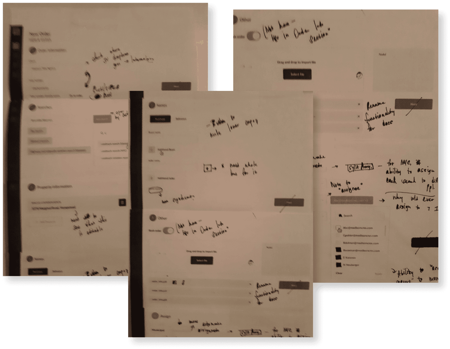
Before starting on research, I put down my thoughts by conducting a simple heuristic analysis. Marking up the current designs highlighted obvious UX issues, contradictions, and extraneous or missing elements.

This gave me focus and a frame of reference for the rest of the research.


Before starting on research, I put down my thoughts by conducting a simple heuristic analysis. Marking up the current designs highlighted obvious UX issues, contradictions, and extraneous or missing elements.

This gave me focus and a frame of reference for the rest of the research.

Contextual Inquiry

Contextual Inquiry

Sitting with employees while they worked gave me a view of the repetition, the exceptions, and the frustration. I combined this with periodic questioning, to give me insight into users’s mental models.

Why this method?

Why this method?

Users of the Order Entry interface are super-users who perform the same actions hundreds of times a day. They also operate in high-complexity spaces, with many moving parts directly affecting their intent and outcomes when interacting with software. These are often subtle and asking genearl questions won’t uncover them. Contextual inquiry can highlight these moving parts and their place in the user journey.

Users of the Order Entry interface are super-users who perform the same actions hundreds of times a day. They also operate in high-complexity spaces, with many moving parts directly affecting their intent and outcomes when interacting with software. These are often subtle and asking genearl questions won’t uncover them. Contextual inquiry can highlight these moving parts and their place in the user journey.

My initial hypothesis that the overly simplified order entry screen was playing a part in the lag was strongly validated. Having an up-close look at the current complexity of the process caused the missing functionality and inconsistent designs to jump out at me.

My initial hypothesis that the overly simplified order entry screen was playing a part in the lag was strongly validated. Having an up-close look at the current complexity of the process caused the missing functionality and inconsistent designs to jump out at me.

Design Principles

Design Principles

Contextual inquiry left me with a jumble of insights, both high level and nitty-gritty. I began the research synthesis by combining the high-level insights with our business goals for the project.

I narrowed down to three “design principles” that would represent the upcoming project. These served as a guide to me in every design decision.

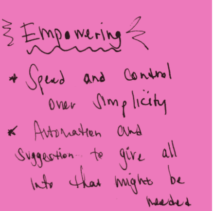
Empowering - speed and control over simplicity, automation, and suggestions to give all info that might be needed

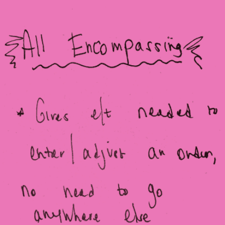
All-Encompassing - Gives everything needed to enter and adjust an order, no need to go elsewhere to handle exceptions

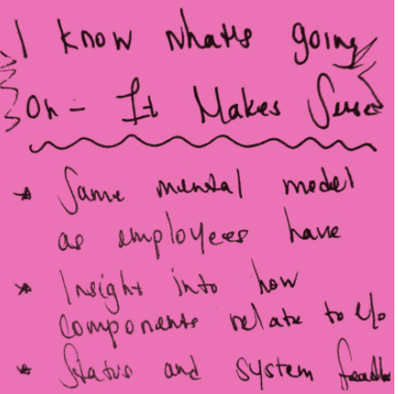
I know what’s going on, It Makes Sense - Same mental models as employees have, insight into how components relate to each other, status, and system feedback

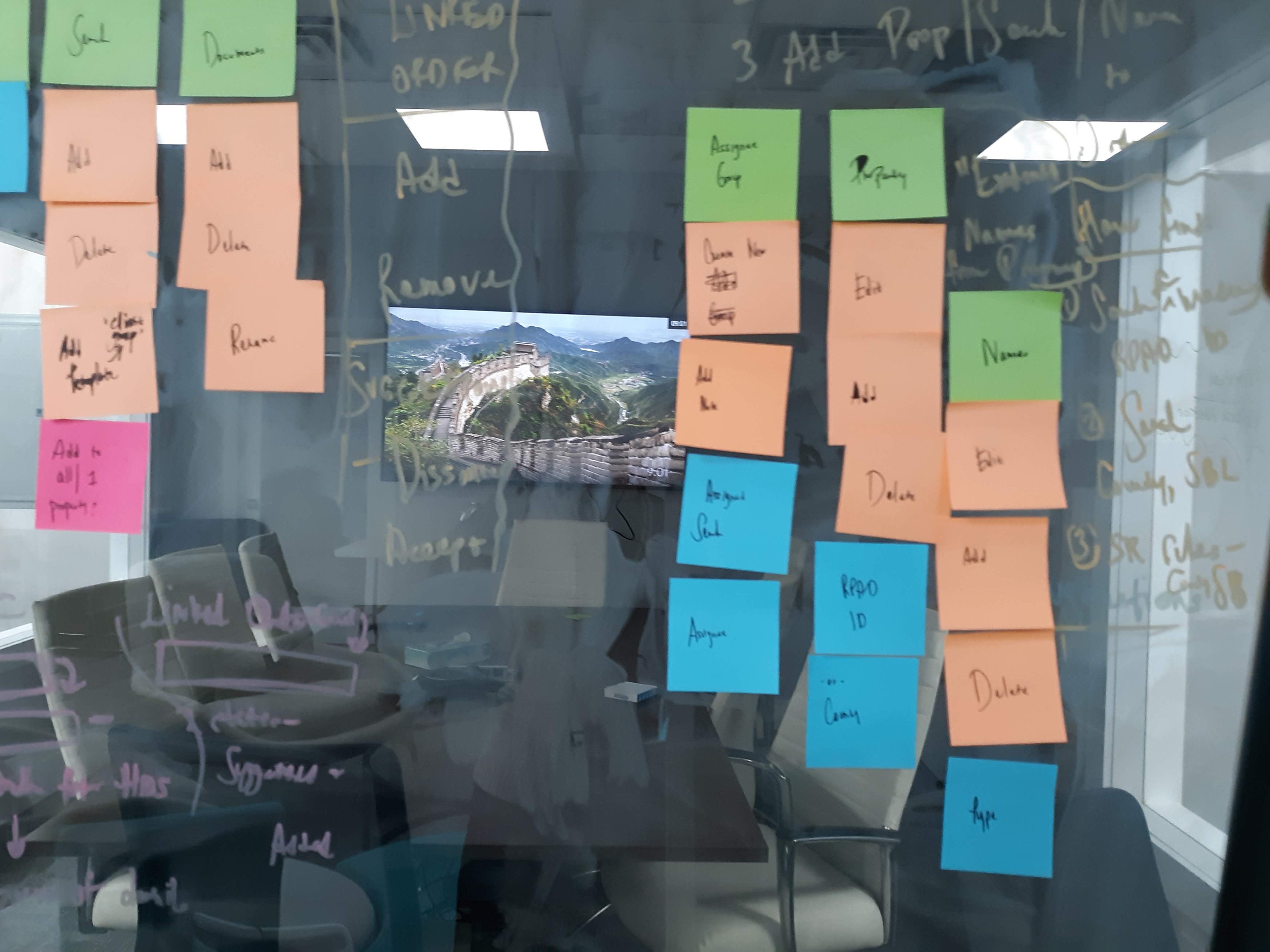
These sticky notes summed up the design themes and were kept in my eyesight throughout the project

These sticky notes summed up the design themes and were kept in my eyesight throughout the project

The Discovery

The Discovery

The design principles pointed me to the underlying and most important issue.

The Order Entry interface had been designed as a very simplified, step-by-step process. However, despite the process’s complexity, much of it is extremely repetitive; Order Entry employees are pros and want to work fast.

The design principles pointed me to the underlying and most important issue.

The Order Entry interface had been designed as a very simplified, step-by-step process. However, despite the process’s complexity, much of it is extremely repetitive; Order Entry employees are pros and want to work fast.

The overly simplified interface did not allow for any flexibility to handle the many crucial exceptions. This dumbed-down approach led to a lot of clicking, decreased flexibility, and no transparency into how the system worked.

Ideation and Design

Ideation and Design

Ideation and Design

OOUX

OOUX

With the problem defined and a clear focus on where to take the design, I wanted to start the solution/ideation with a clear mind. I created an object model of objects included in Order Entry and their relationships - an exercise known as OOUX, Object Oriented User Experience.

Separating objects and actions from the existing interaction design gave me an objective view of the bare bones of Order Entry. This allowed me to start fresh, instead of working on top of a flawed model.

Partial view of OOUX model. Charting out system objects, components, and actions gave me an objective view of the bare bones of Order Entry, outside of the current interaction design.

Partial view of OOUX model. Charting out system objects, components, and actions gave me an objective view of the bare bones of Order Entry, outside of the current interaction design.

Partial view of OOUX model. Charting out system objects, components, and actions gave me an objective view of the bare bones of Order Entry, outside of the current interaction design.

The model showed me clearly which interactions were more broken down and detached than they needed to be. Components which were currently broken into different steps actually were very interrelated both in users’ mental models and in the technical architecture.

Together with some developer input, I redid the model to a more ideal state. I combined a few sections, and moved around some functionality to be part of a section it fit in better.

Design Iteration

Design Iteration

Each individual section of the Order Entry screen required many rounds of ideation and iterations, and had the Design Principles applied in different. Some examples -

1

1

Add and Assign Products

Add and Assign Products

Assignment of products had always been a simple model of one assignee per product type. Now, more complex orders needed product types to be divided, with different assignees getting different parts.

Assignment of products had always been a simple model of one assignee per product type. Now, more complex orders needed product types to be divided, with different assignees getting different parts.

Assignment of products had always been a simple model of one assignee per product type. Now, more complex orders needed product types to be divided, with different assignees getting different parts.

How might we provide the flexibility needed for complex exception cases, while still keeping the default interactions simple?

After some ideation, I settled on two different interactions for this feature.

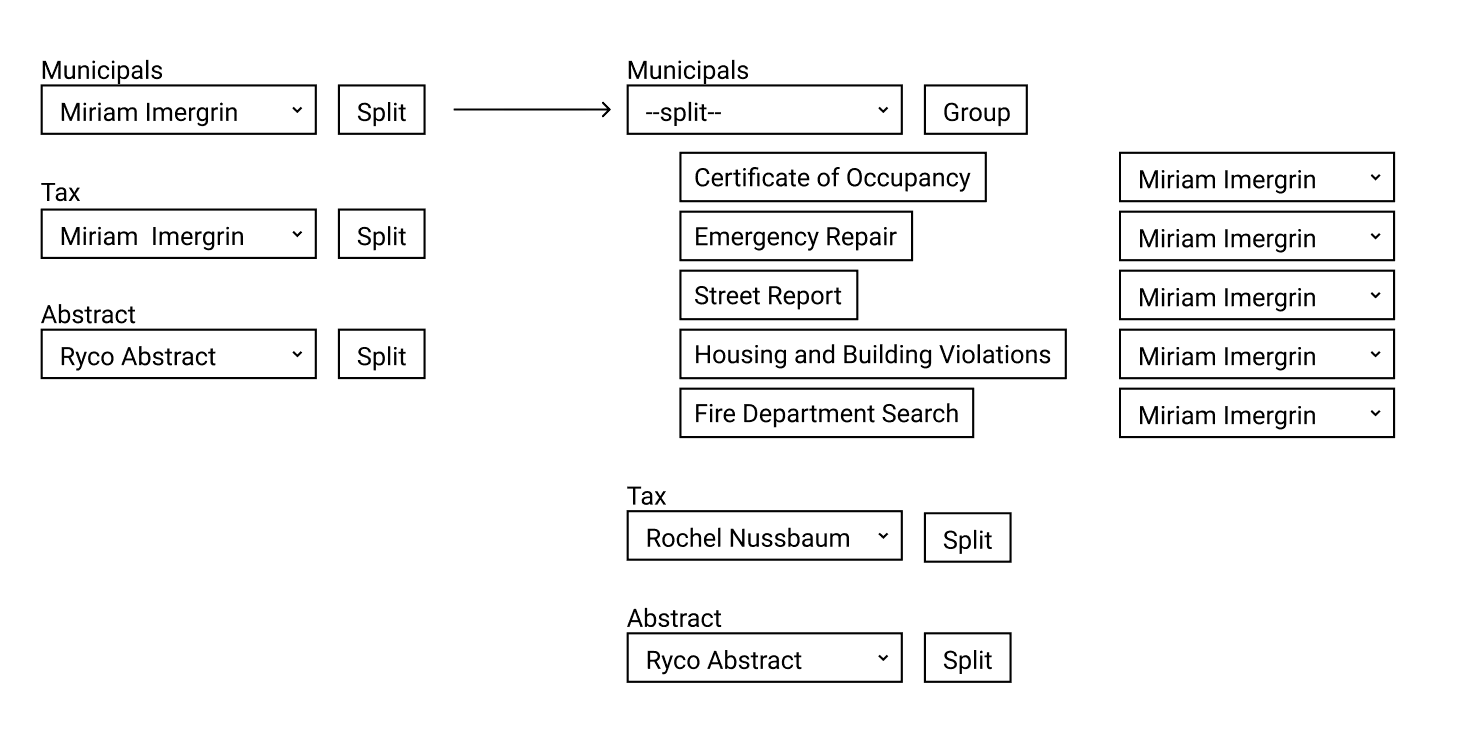
Option 1 worked with the current version of assigning every group to a user, but with an added Split button which opened separate fields for each product of that type to specify a different assignee for each.

After some ideation, I settled on two different interactions for this feature.

Option 1 worked with the current version of assigning every group to a user, but with an added Split button which opened separate fields for each product of that type to specify a different assignee for each.

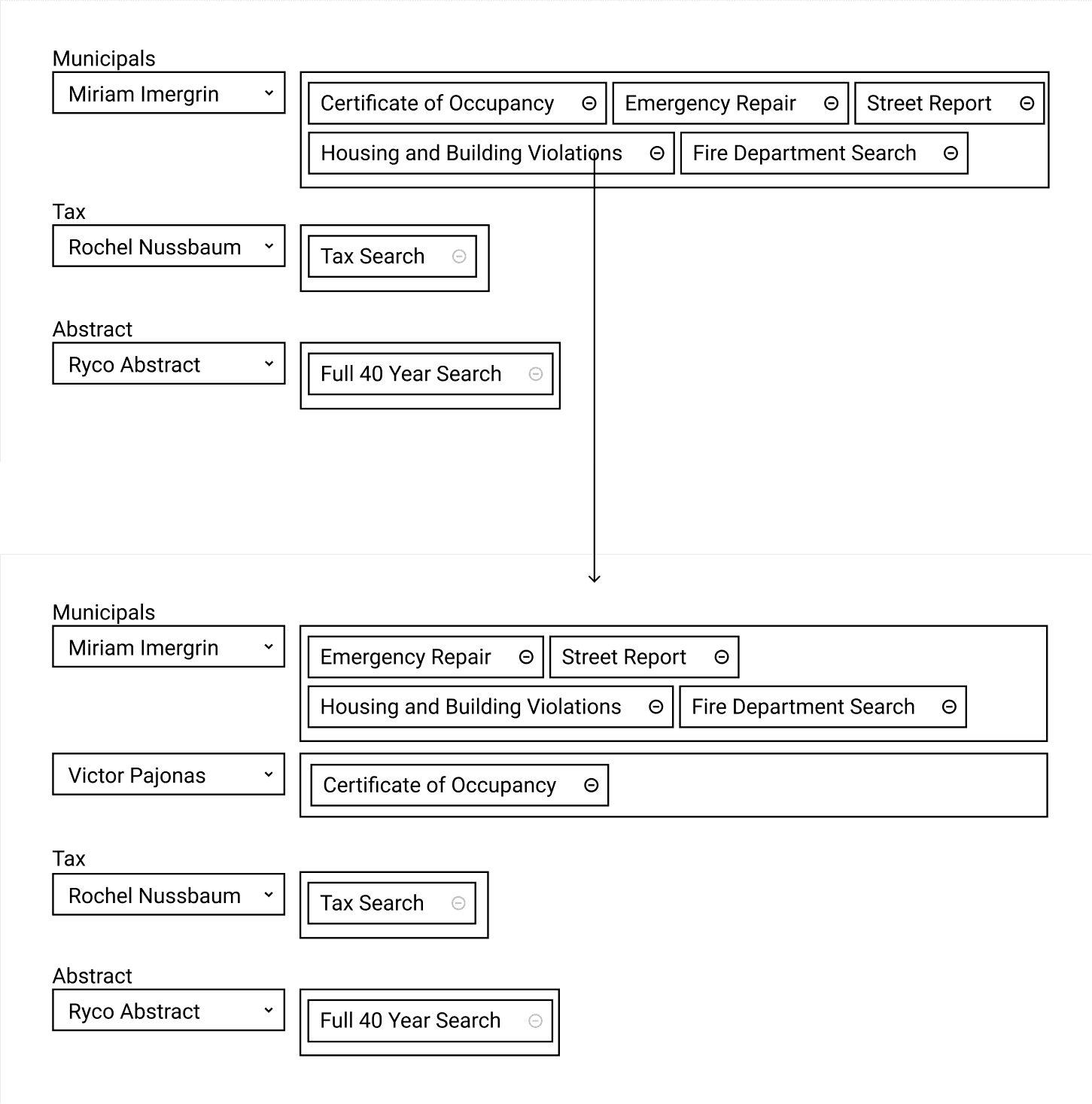
Option 2 divided products into their types, all populated together by default with one assignee. Clicking “remove” on a product sent it to its own box with a separate assignee - thereby creating 2 groups from that search type.

Option 2 divided products into their types, all populated together by default with one assignee. Clicking “remove” on a product sent it to its own box with a separate assignee - thereby creating 2 groups from that search type.

User Testing

User Testing

User Testing

With these two options, I became stuck while choosing one. The first design would be fewer clicks and steps on a day-to-day basis. The “split group” design had the advantage of being a more common pattern and would be easier for front-end development and training. Unsure how to proceed, I turned to user testing to give me insight.

With these two options, I became stuck while choosing one. The first design would be fewer clicks and steps on a day-to-day basis. The “split group” design had the advantage of being a more common pattern and would be easier for front-end development and training. Unsure how to proceed, I turned to user testing to give me insight.

The Outcome

The Outcome

The Outcome

Users did fine with both in terms of usability. On questioning, though, all expressed a strong preference for option #2. They were concerned that the hidden element of option #1 would cause them to forget to split the assignment.

This was especially important since the whole feature of breaking out groups was for exception cases, and users would not get used to automatically breaking them out. Option #2 allowed them to not only handle exceptions but also easily scan all products in the order for them.

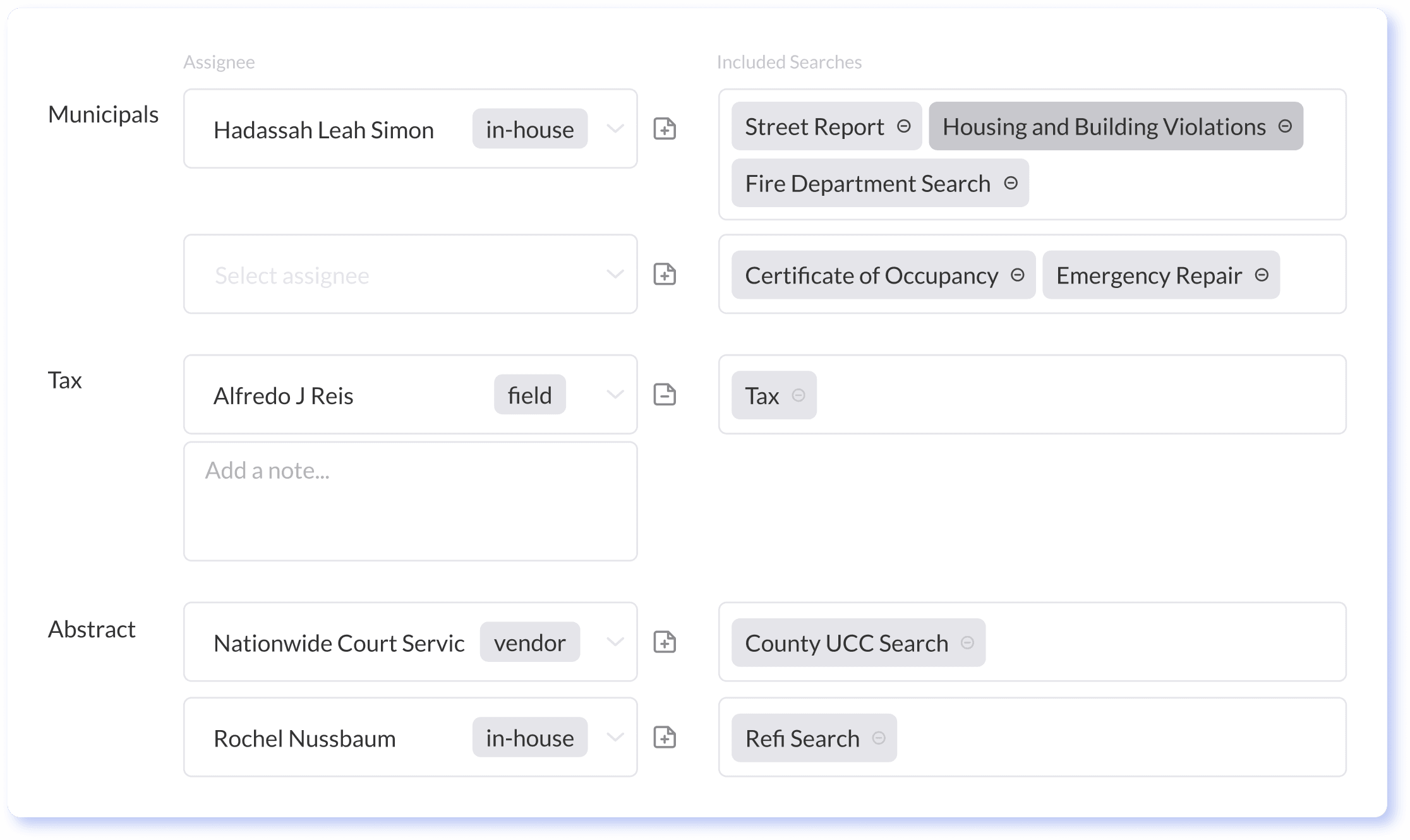
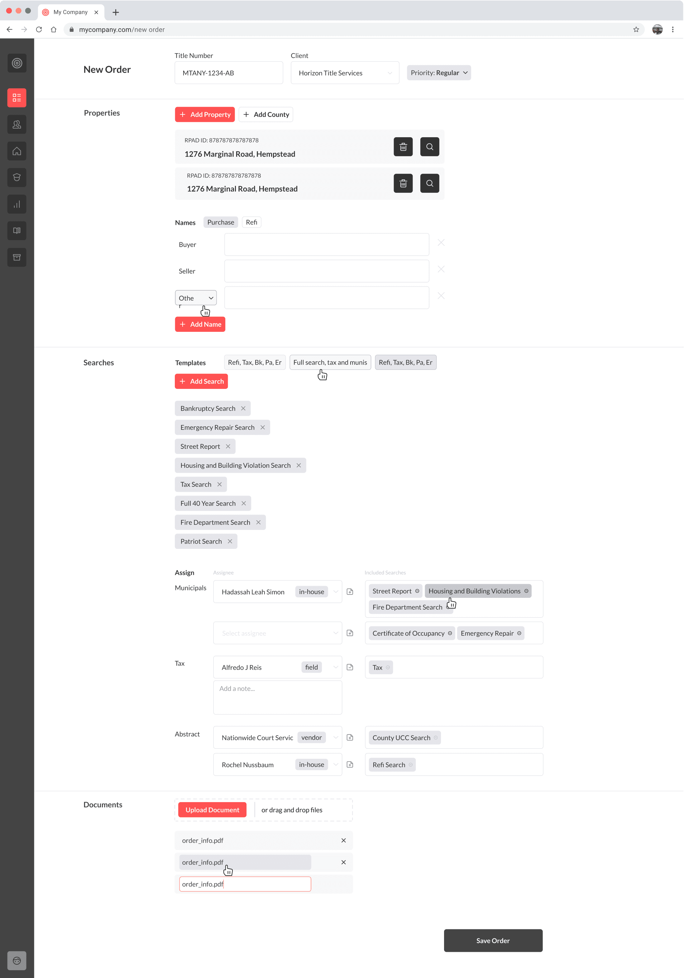
Final design of the assign feature. Searches populated together with their types by default, but an easy remove button allowed them to be moved to their own category for exception-case assigning.


2

Adding Multiple Items

Adding Multiple Items

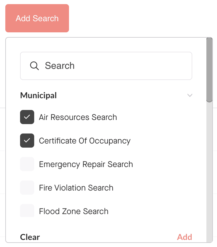
The traditional “add items” module was working fine. It featured a searchable list of items, with checkboxes and a button to confirm to add.

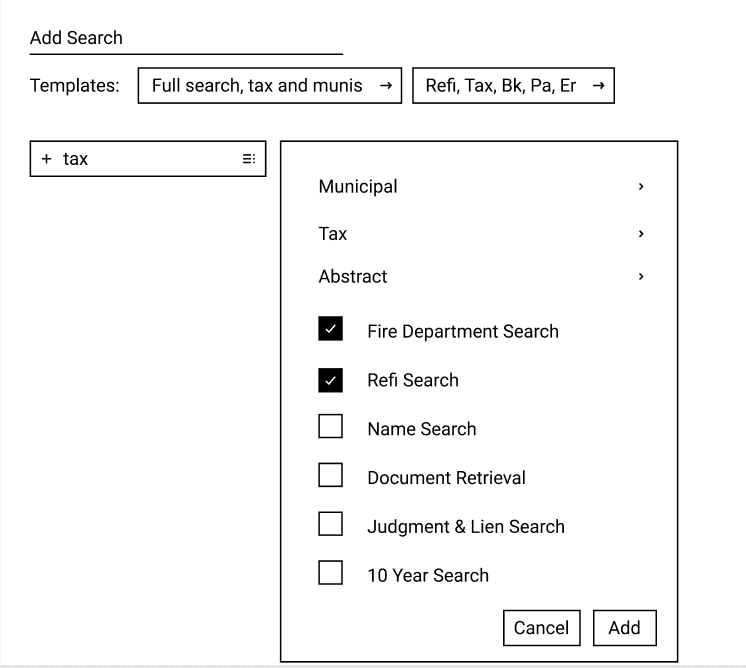
So it was a surprise when in testing, users preferred a new option, featuring just a list of items with no checkboxes and no place to confirm. This design called for fewer clicks, so while less traditional, users got used to it quickly. The module stayed open while a user clicked on any item to add it. They’d click a close button to remove the module when done.

Original “Add Items” design

Original “Add Items” design

Wireframes used to test the new “Add multiple items” module

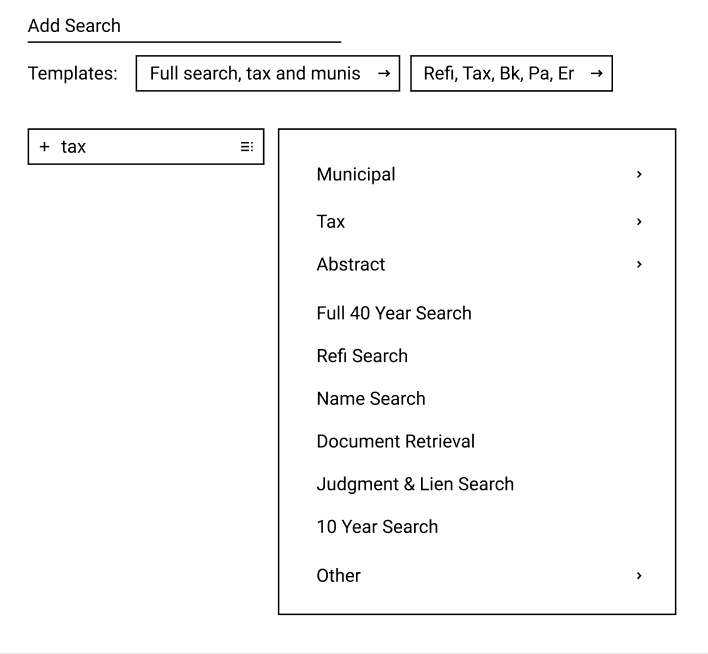
Research had shown me that Adding Multiple Items could be done in two very different ways. Searching for a specific item to add was used in conjunction with a package, when a client wanted their regular package with a slight difference. Viewing a full list was used when no package was present and the employee had to go through the entire list to pick out the ordered items.

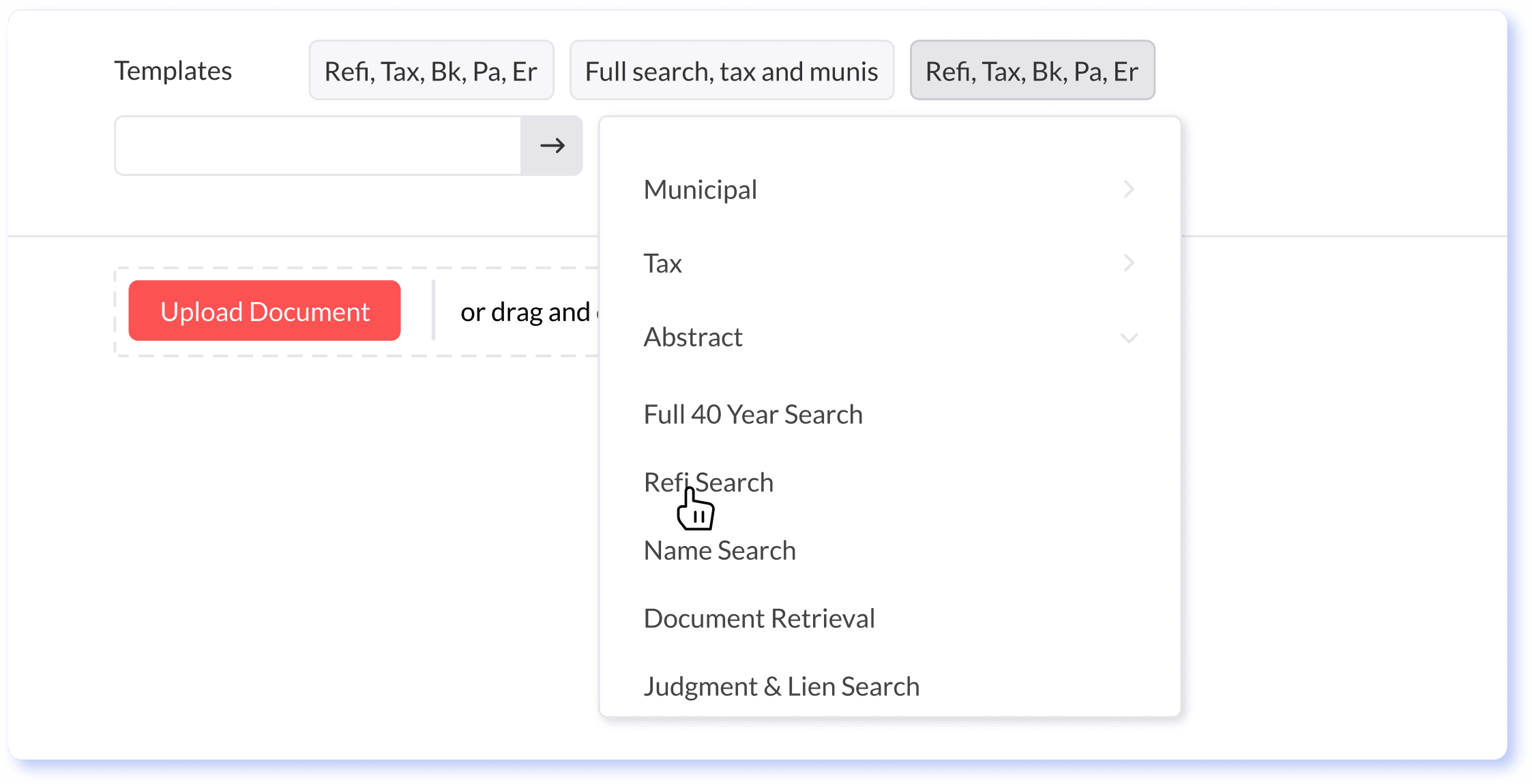
I broke these two functions apart in the new designs. Users could type in the search box to add, but also click to expand to view a full list of options.

3

3

Assign to Team Now, Later

Assign to Team Now, Later

The system completely centered around statuses, loosely following the workflow and team structure. Problems arose because of the many exception cases in which a portion of the process is not needed, and the products have to be passed on to the next team in the queue. However, skipped items can not get to the next team before the rest of the order is ready, as the team will be missing context provided by the rest of the order that is crucial for completing the work.

The system completely centered around statuses, loosely following the workflow and team structure. Problems arose because of the many exception cases in which a portion of the process is not needed, and the products have to be passed on to the next team in the queue. However, skipped items can not get to the next team before the rest of the order is ready, as the team will be missing context provided by the rest of the order that is crucial for completing the work.

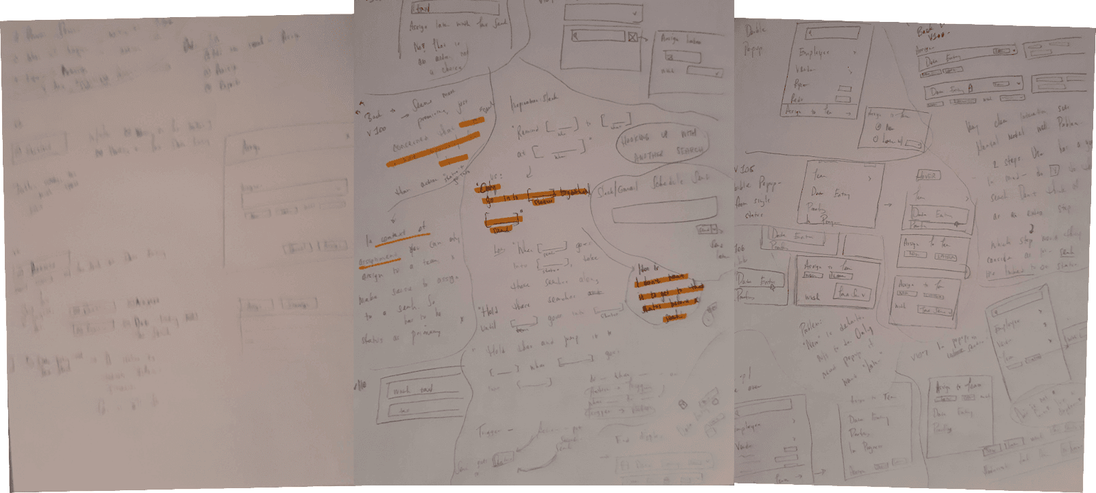
Exploring the visual representation of what this action/trigger actually was

Solution: Create a “queue” in which an item can be held until the rest of the order is ready for the team.

The challenge with designing this feature was that the logic itself is abstract and complex. I wanted to craft a visual control that worked in the way that users understand this to work, not the way the database works, while still being technically feasible.


Questions that had to be considered:

Of the few steps/controls, which does the user consider as their actual goal?

How can we allow the user to skip dealing with extra settings when using “assign now”, the default

Logically, you first specify the trigger, than the action. However, the action is the user’s end goal, not the trigger…

Iterating on dozens of mental models and visual representations to represent the queue concept and its relation to statuses. Highlighted are components used in the final design.


I clarified the mental model in a large part using users’ language of describing their needs.


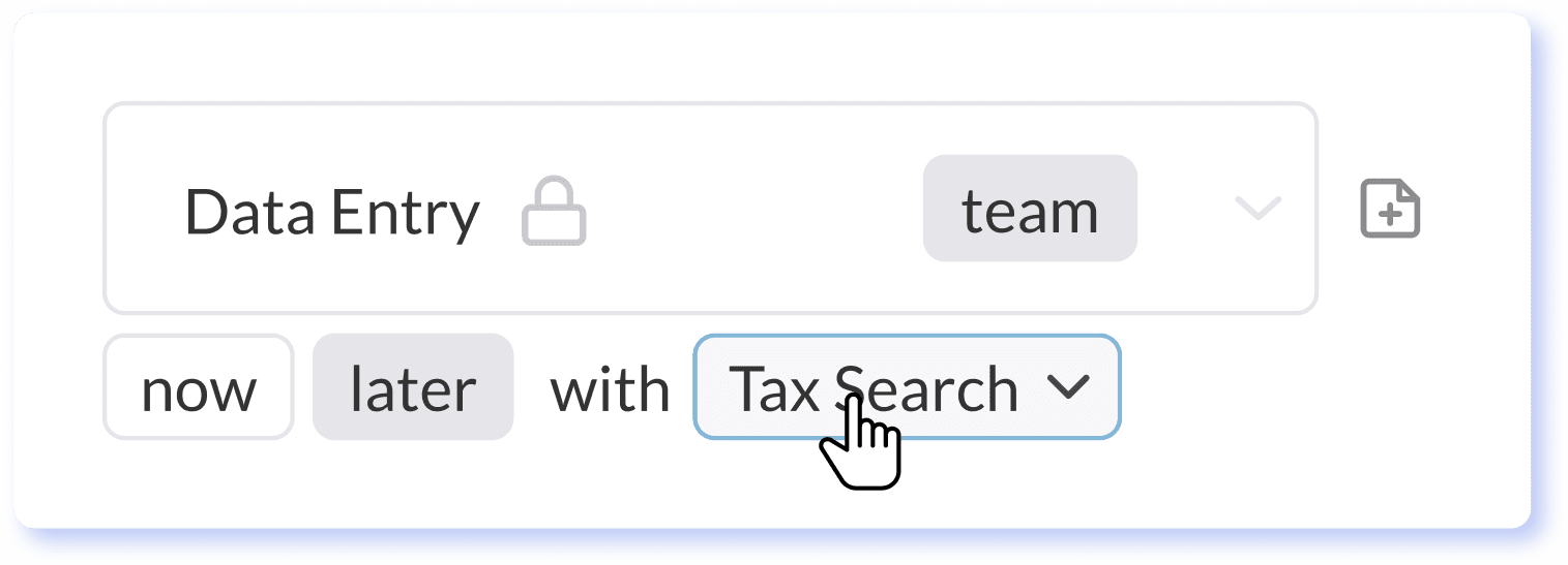
Using this language allowed me to directly translate it into a visual control, where a user first chooses to assign this ‘Later’ and then chooses with what it should go.

I clarified the mental model in a large part using users’ language of describing their needs.


Using this language allowed me to directly translate it into a visual control, where a user first chooses to assign this ‘Later’ and then chooses with what it should go.

How would you tell the system what to do?

Only allow this item to go into [a status] together with [a chosen item].

The final design was a simple and elegant control that allowed users to set the behavior without any understanding of the technical and complex nature of the interaction.

Final Design

Final Design

Final Design

Handoff

Handoff

A design is only as effective as the product that gets put into the world - by software developers. Part of ensuring a smooth handoff is knowing the project’s developers and how they worked. For this project, I created a full functional spec Word document, put feature details into Jira tickets, and also comprehensive annotation into the Figma designs.

A design is only as effective as the product that gets put into the world - by software developers. Part of ensuring a smooth handoff is knowing the project’s developers and how they worked. For this project, I created a full functional spec Word document, put feature details into Jira tickets, and also comprehensive annotation into the Figma designs.

Extensive annotations in Figma helped more visual developers understand all requirements in context.


Conclusion

Conclusion

Conclusion

This project pushed me in many ways due to the complexity of use cases and user context. A few rounds of iteration were never enough - every little complexity had to be designed for, and I went through dozens of iterations before landing on something that accommodate all situations.

Although not as crucial in simpler applications, the primary user experience always takes place in subtle contextual needs and the overlooked details - I’m confident I’ll be using these expanded skills over and over again.